The properties dialog for the textbox element contains three tabs, as follows:
You can modify the properties for the textbox element from this dialog box. The tabs are more fully explained below.
Textbox control
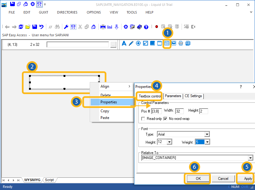
The Textbox control tab appears as shown below.

The available parameters are as follows.
- Pos
-
Specifies the textbox's onscreen coordinates. This is a read-only field - it is not user-modifiable.
- Width
-
Specifies the textbox's width in pixels. This is also a read-only field.
- Height
-
Specifies the textbox's height in pixels. It is a read-only field.
- Read-only
-
Specifies if the textbox is read-only. If this is checked, no user entry is permitted.
- No word wrap
-
Specifies if the text entered in the textbox will or will not wrap. If this is checked, the text will not wrap.
- Font
-
Specifies the font characteristics for text entered in the textbox. The available options are as follows.
- Type
-
Specifies the name of the font family. Examples would be Arial, Times, etc.
- Height
-
Specifies the font height in pixels. You can select the height from a drop-down list.
- Weight
-
Specifies the font weight. The default is five. Increase the number to make the text heavier; decrease to make the text lighter. Select the weight from the drop-down list.
- Relative To
-
Choose another element on the screen to use as the base to postiion the new textbox. You can select other screen elements from a drop-down list.
Parameters
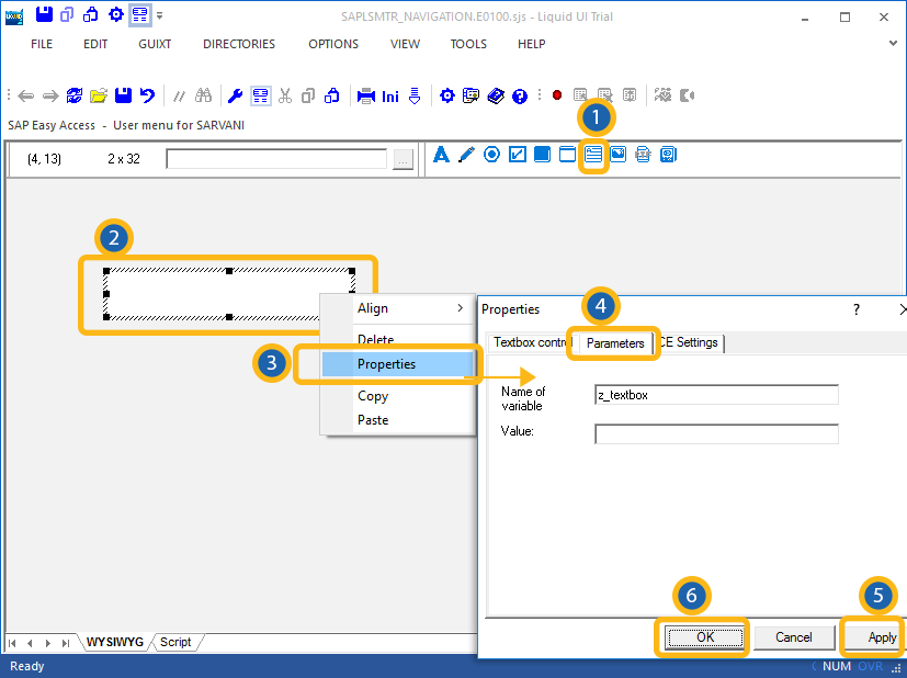
The Parameters tab enables you to link a variable with a specified value. The tab appears as shown below:

Once you enter a variable name in the Name of variable field, the 'Value' field will become editable, and you can enter the value you want to link with your new variable.
CE Settings
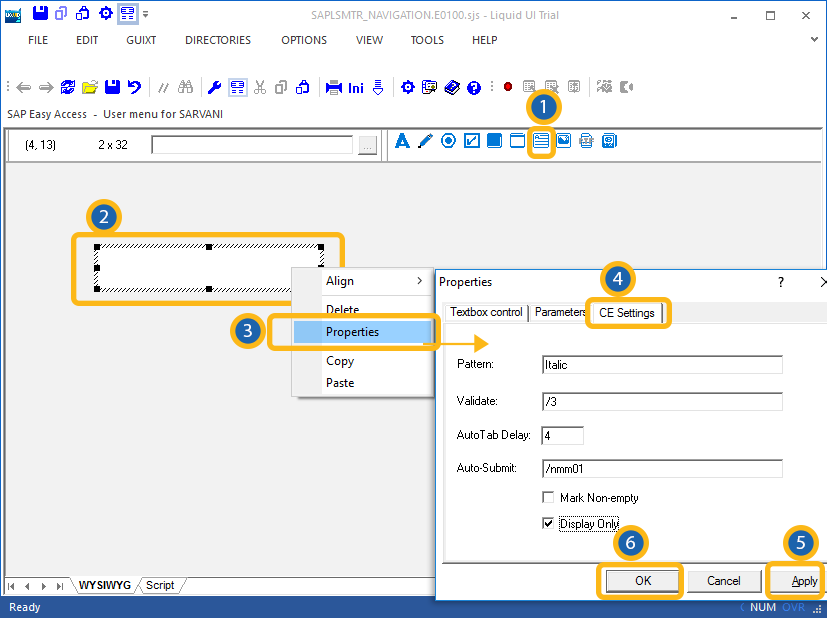
The CE Settings tab is used only if the screens being created are intended for use with the Mobile solution. This tab enables you to specify Smart Attribute patterns for the editfield. Please see the Mobile documentation for a complete explanation of Smart Attributes and how they are used. The CE Settings tab appears as follows:

The available options are defined as follows:
- Pattern
- You can specify a specific character pattern for the edit field.
- Validate
- You can specify whether or not the field is to be checked to determine if content is valid.
- Auto Tab
- You can specify a delay in seconds before the next field is automatically processed.
- Auto-Submit
- You can enter a transaction or a function code to be executed.


