The properties dialog for the Editfield element contains four tabs, as follows:
You can modify the properties for the text element from this dialog box. The tabs are more fully explained below.
Edit control
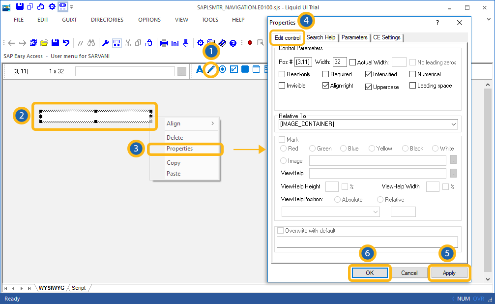
The Edit control tab appears as shown below.

The available parameters are as follows.
- Read-only
-
Changes the field into a non-editable field where no data can be entered.
- Required
-
Specifies that you cannot proceed to the next screen until the values for this field have been correctly entered.
- Numerical
-
Specifies that the value entered must be a number. No other values are permitted.
- Invisible
-
Specifies that the values entered in the field will be unreadable to anyone. This typically results in the values being transformed into asterisks.
- Align-right
-
Specifies that the values entered in the field are aligned with the right-hand edge of the field. Values are left-aligned by default.
- Uppercase
-
Specifies that all values entered in the field must be in uppercase. No lower case entries are permitted.
- Leading space
-
Specifies that there must be a leading space before any other values entered in the field.
- Relative To
-
Specifies if the element is being positioned relative to another screen element.
- Mark
-
Specifies if the text is marked or not. Marked text is colored to make it stand out. The color checkboxes located below this field are the various colors you can use to mark text.
- Image
-
If the element is linked to an image, the image path is specified here.
- Viewhelp
-
If the element is associated with any viewhelp, the source can be specified here.
- Viewhelp Height
-
Specify the actual height of the viewhelp window in pixels. Check the smaller checkbox to use the number as a percentage of the orginal size.
- Viewhelp Width
-
Specify the actual width of the viewhelp window in pixels. Check the smaller checkbox to use the number as a percentage of the orginal size.
- Viewhelp Position
-
Specify the onscreen position of the viewhelp window in pixels. This can be either the actual position (absolute) or the position relative to another element.
- Overwrite with default
-
Specifies what the default value for the field will be.
Search Help
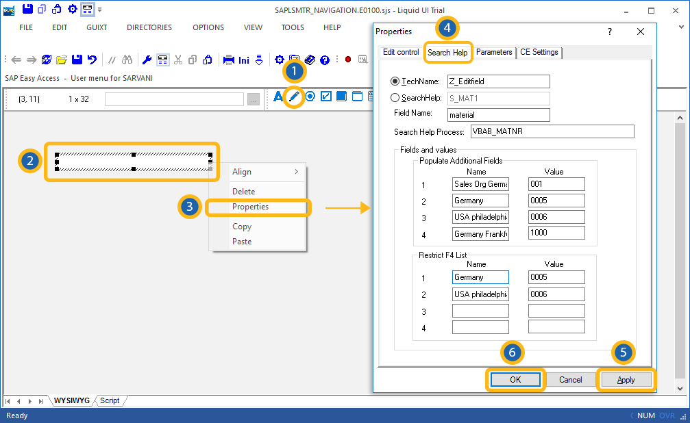
The Search Help tab enables user to specify search help for the edit field. The tab appears as shown below:

The available parameters are as follows.
- TechName
-
Specifies the technical name of the editfield.
- Searchhelp
-
Specifies the searchhelp domains that will be associated with the editfield.
- Fieldname
-
Specifies the onscreen name of the editfield.
- SearchHelp Process
-
Specifies if a process is triggered by searchhelp.
- Fields and Values
-
The Fields and values section enables you to specify the values that are available for population in a given field. You can specify up to four field that will be auto-populated when the initial field is populated. You can also restrict the list by entering values to be excluded in the Restrict F4 List section. As in the Populate Additional Fields section, you can specify up to four name-value pairs to be restricted.
Parameters
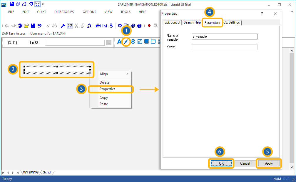
The Parameters tab enables you to link a variable with a specified value. The tab appears as shown below:

Once you enter a variable name, the 'Value' field will become editable, and you can enter the value you want to link with your new variable.
CE Settings
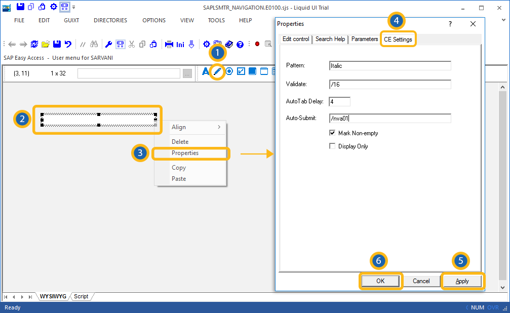
The CE Settings tab is used only if the screens being created are intended for use with the Mobile solution. This tab enables you to specify Smart Attribute patterns for the editfield. Please see the Mobile documentation for a complete explanation of Smart Attributes and how they are used. The CE Settings tab appears as follows:

The available options are defined as follows:
- Pattern
- You can specify a specific character pattern for the edit field.
- Validate
- You can specify whether or not the field is to be checked to determine if content is valid.
- Auto Tab
- You can specify a delay in seconds before the next field is automatically processed.
- Auto-Submit
- You can enter a transaction or a function code to be executed.


